2018

Consumer experiences

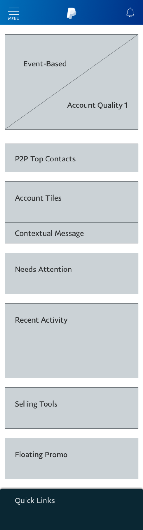
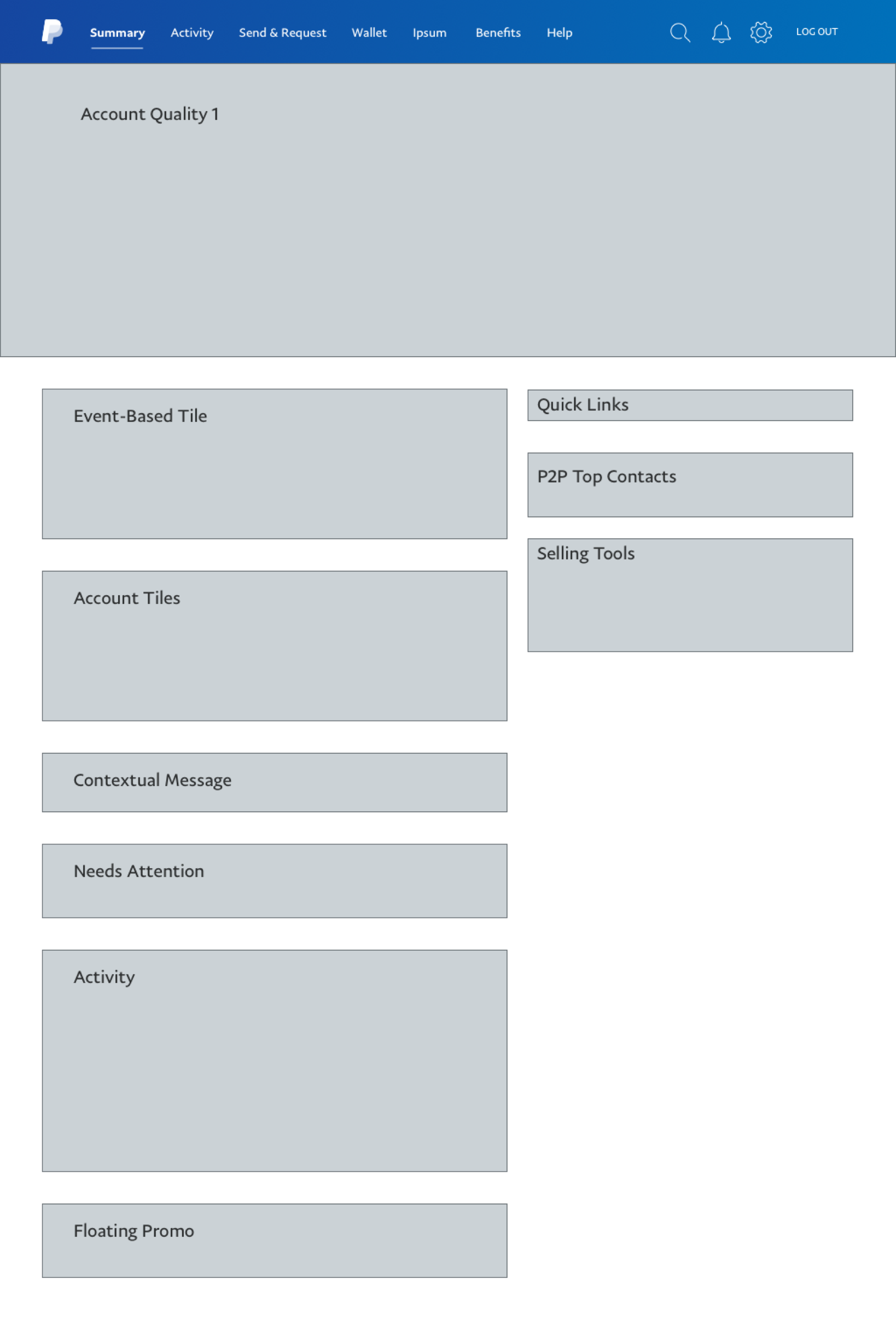
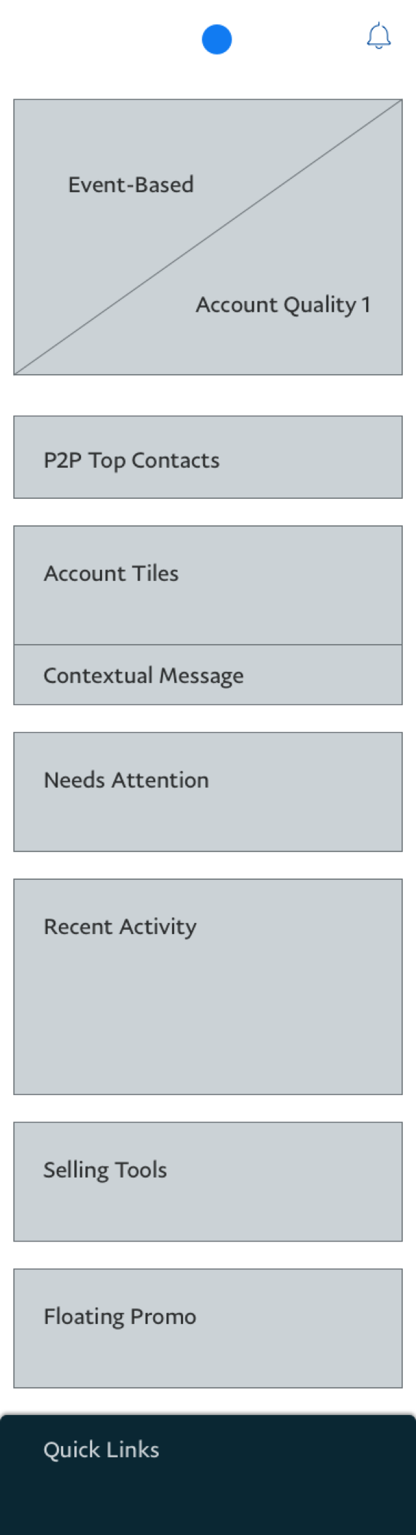
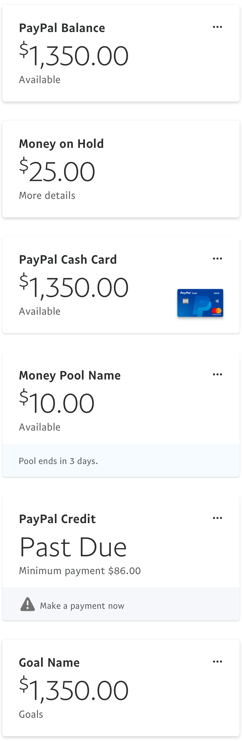
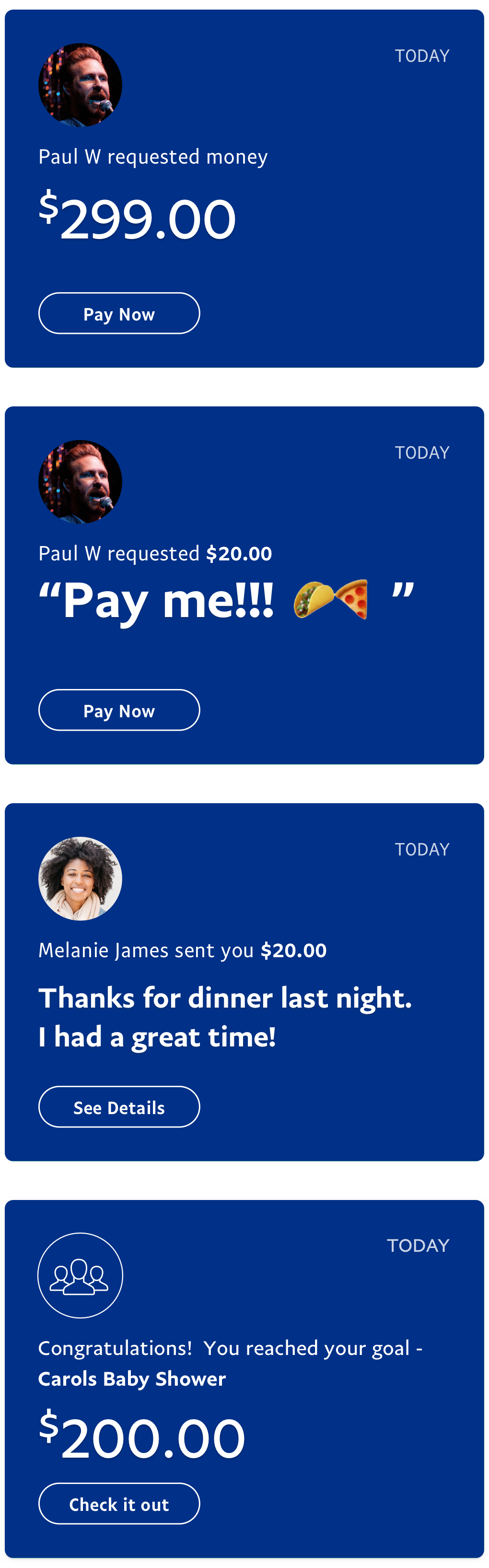
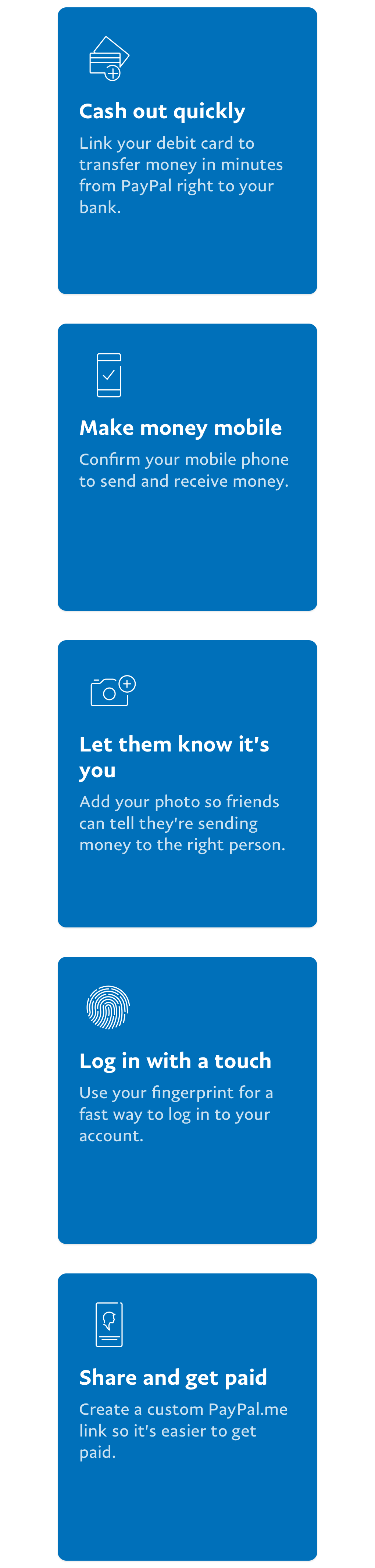
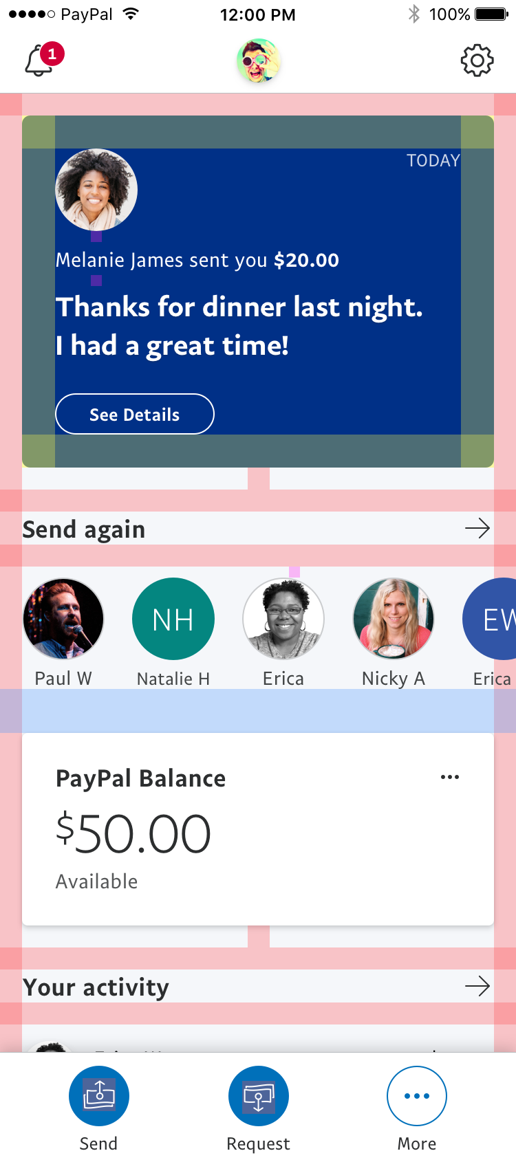
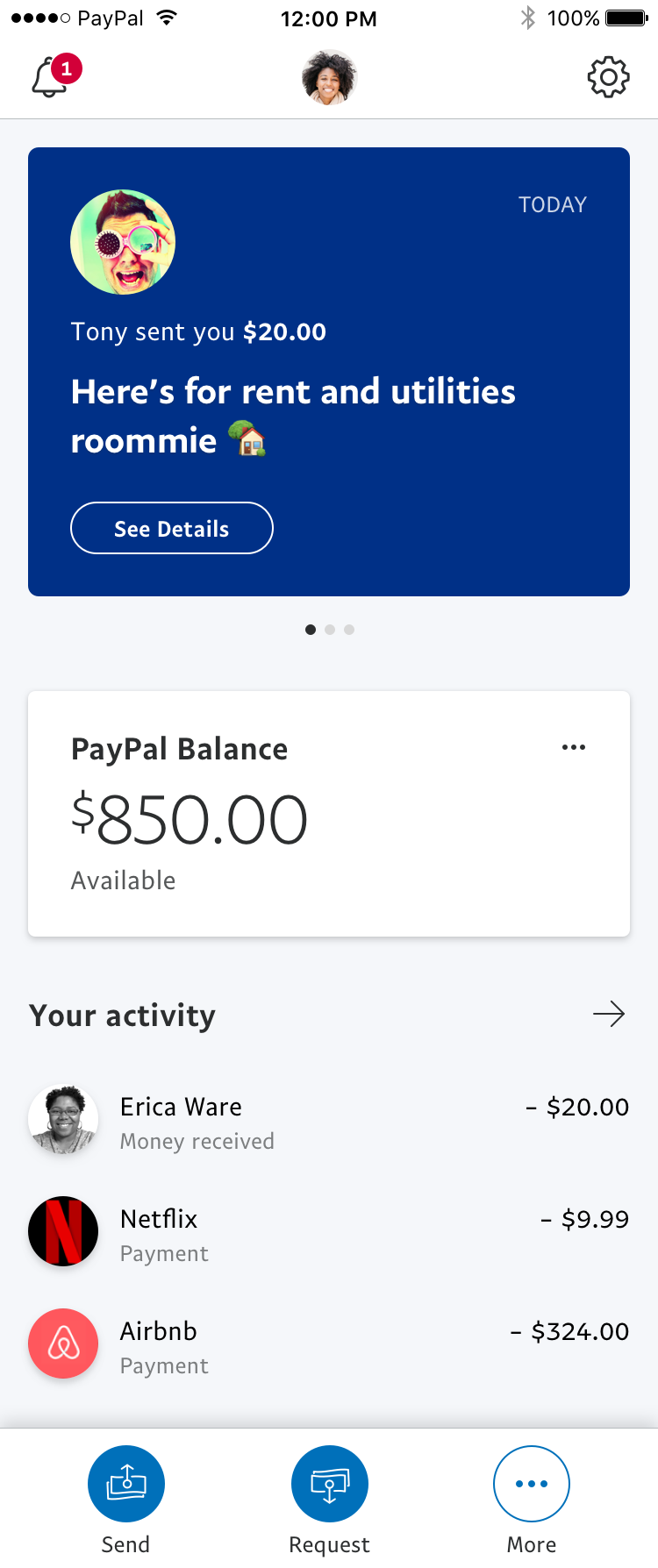
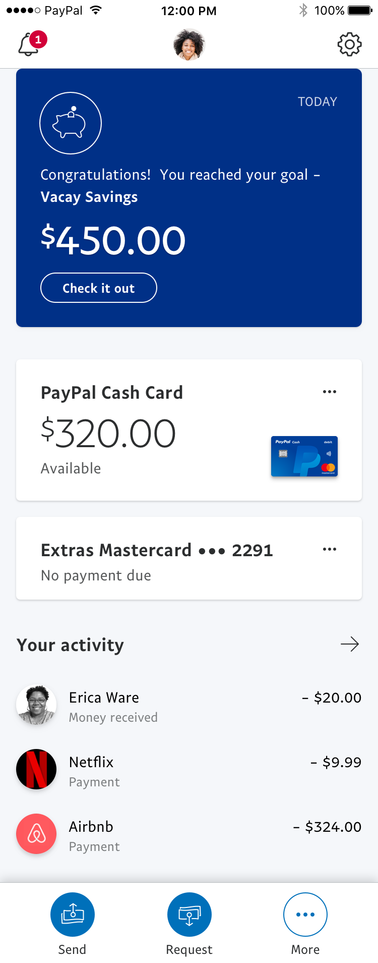
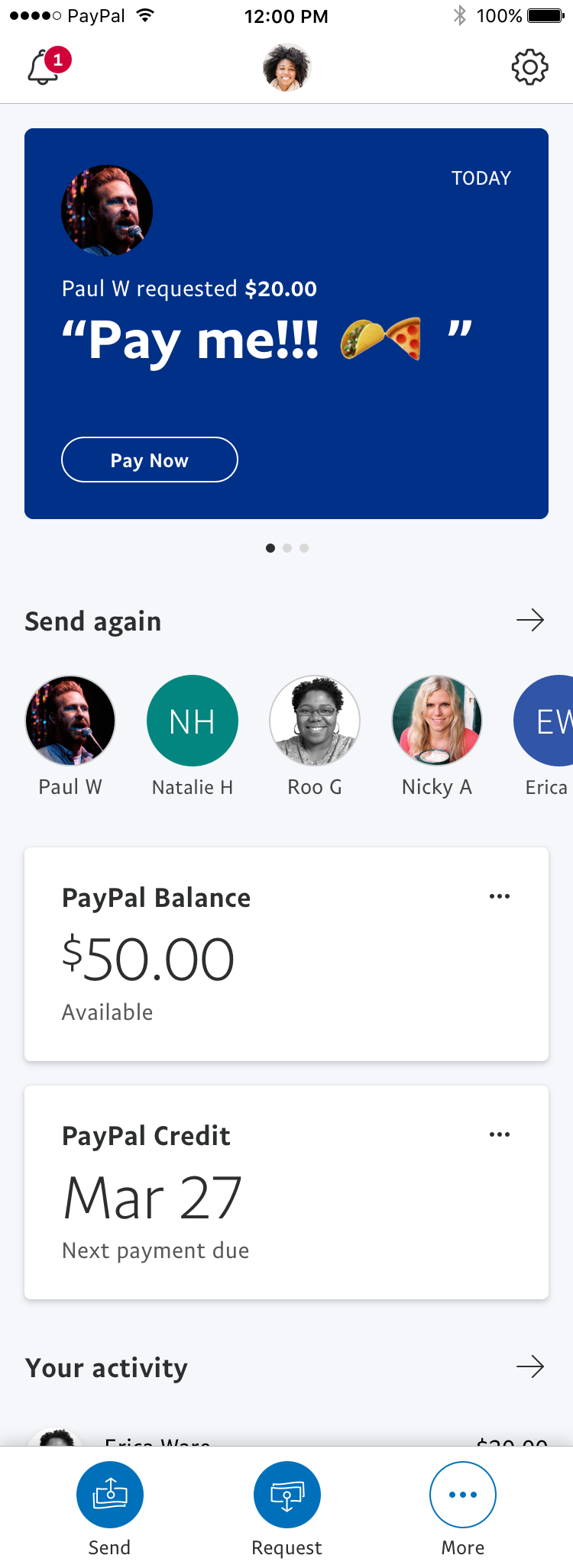
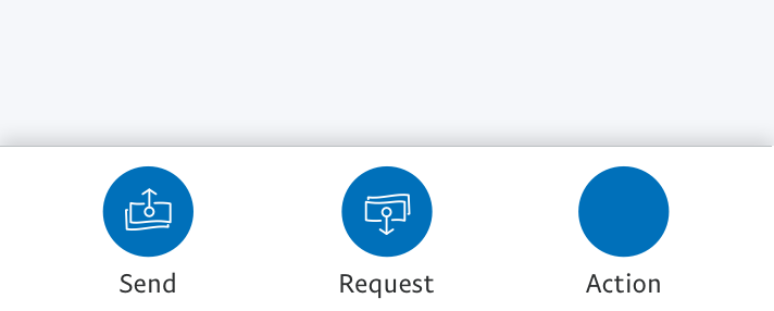
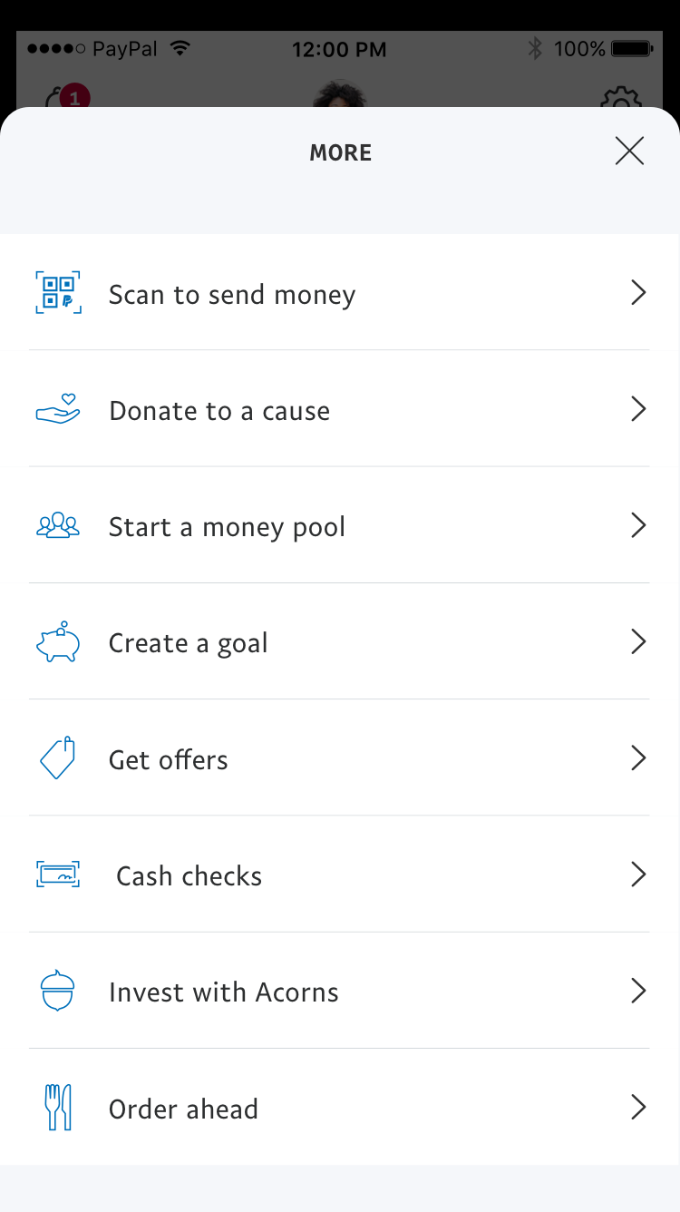
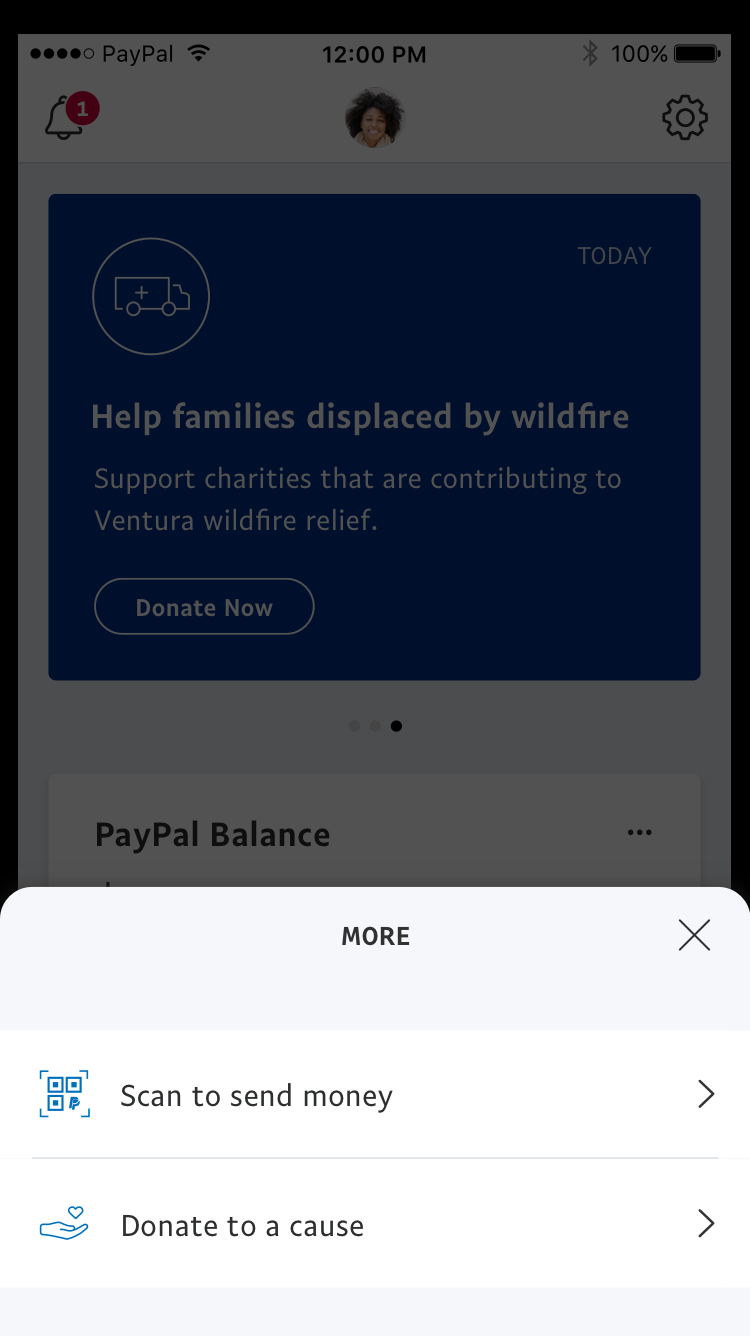
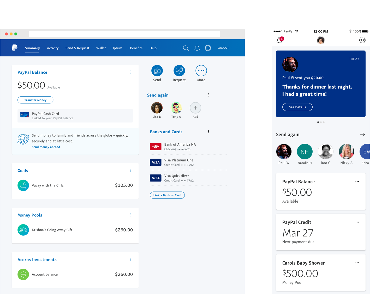
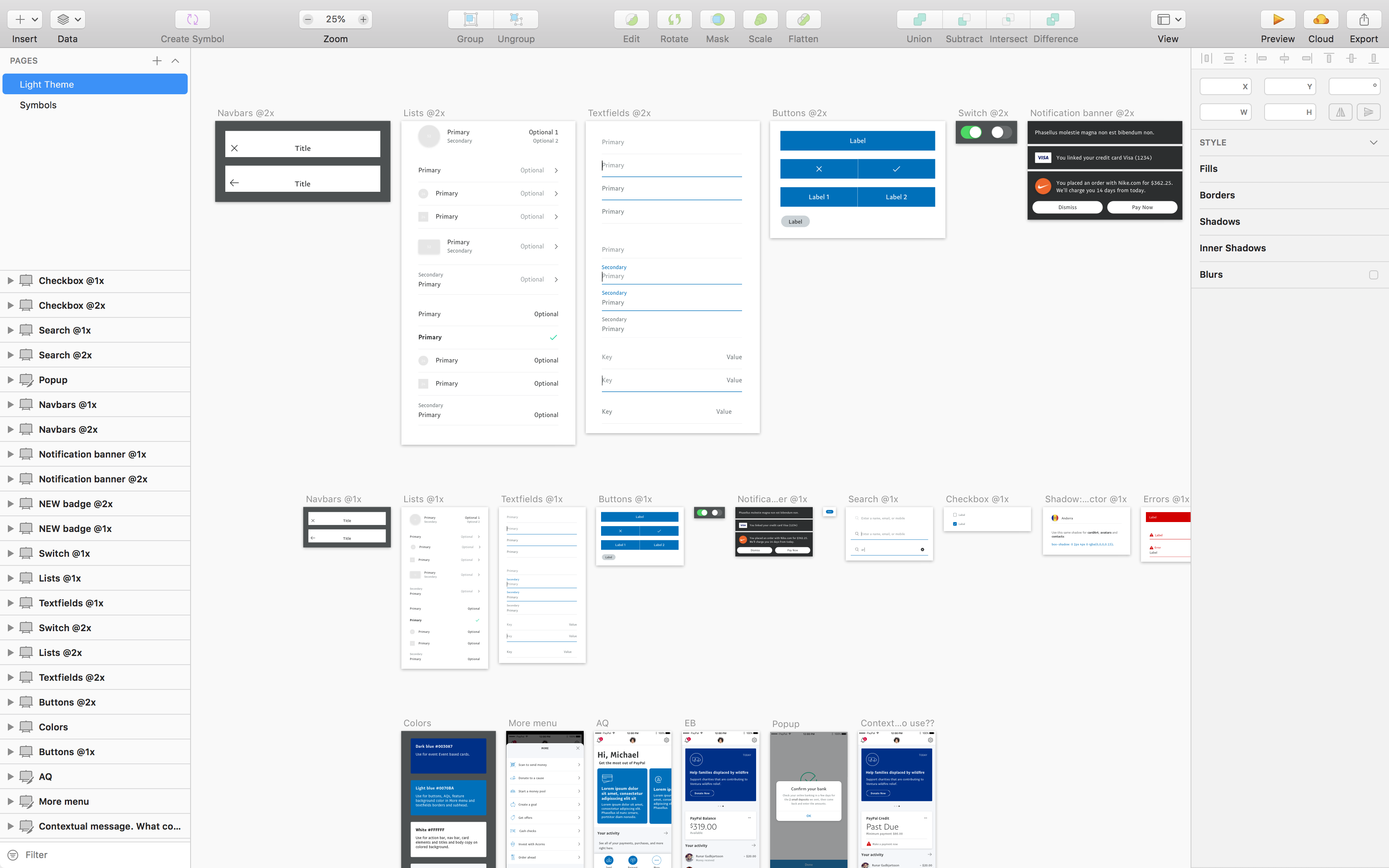
With this new redesign, PayPal wanted to bring more focus and attention to sending and requesting money—as well as making these typically mundane transactions, to be more engaging and personalized.

I was part of the Home team which led the overall redesign of the PayPal consumer experiences.

PayPal revamps its app to remove clutter, add more personalization

Read article

PayPal's redesigned app is all about paying your friends

Read article

PayPal Mobile Updates Make Small Business Payments Faster and More Secure

Read article

PayPal is a global leader in financial services and the consumer experience is a very complex beast.

Our mission was to tailor the customer experience as people progress throughout their PayPal journey and deliver an at-a-glance, personalized view, that highlights the overall status of their accounts.

Mobile web
Website
App

Modular framework for a flexible yet regulated layout

As the Home team, we wanted other product teams to have the freedom to design, test and build within their own tiles.

Focus on the core features, Send and Request

In the app, Send and Request are now highly visible on the homescreen. In addition, we added a More menu with other features and essentially more things you can do with PayPal.

Testing 1, 2, 3

This was definitely not a single iteration process—we had to account for every team and continual feedback from leadership. We also did in-person and remote testing which helped to make sure we were solving actual problems for our customers. Whether it was a screen prototype, customer interview or a simple paper card-sort, these weekly sessions helped us to validate, test ideas and iterate quickly.

Aligning the design of web and app

A really big business objective was to better align our web and app experiences. Previously, they felt very disjointed—like two seperate products. Visually, they looked different and functionally, behaved different. Therefore, we made sure we were designing the web and app experiences in parallel.

Last minute color changes

Initially, Home was the only area that was getting redesigned. A core aspect of the previous app design approach was to embrace brand colors and gradients and map them to features. With this new update, we were going with a more modern, clean and simple look. However, as we got closer to the launch date, we realized how "broken" the experience was if the rest of the app stayed in the older design. So in a record amount of time and a whole lot of team effort—we were able to update the entire app to follow this new color scheme.